What We Learned Publishing 165 Research Visuals
Designing research figures is hardest when most of the research is not results. Ethen Research Lab's 40 papers carry 165 original visuals: 40 header images, each labeled as containing no data, and 125 figures, each carrying an evidence badge inside the image — proposed architecture, experiment design, proposed measurement framework, qualitative matrix, conceptual diagram and a few others. Not one plots a measurement, because none of the papers reports new Ethen measurements. The central lesson was that a figure's form is itself a claim about evidence: a bar chart says "we measured this", even when it was drawn from opinion. So we labeled evidence inside every image, never drew data we did not have, used one restrained visual system, wrote captions that say what a figure does not show, and treated alt text as content. This article explains those lessons and what we would change.
Designing research figures is hardest when most of the research is not results. Ethen Research Lab's 40 papers carry 165 original visuals: 40 header images, each labeled as containing no data, and 125 figures, each carrying an evidence badge inside the image — proposed architecture, experiment design, proposed measurement framework, qualitative matrix, conceptual diagram and a few others. Not one plots a measurement, because none of the papers reports new Ethen measurements. The central lesson was that a figure's form is itself a claim about evidence: a bar chart says "we measured this", even when it was drawn from opinion. So we labeled evidence inside every image, never drew data we did not have, used one restrained visual system, wrote captions that say what a figure does not show, and treated alt text as content. This article explains those lessons and what we would change.
Key takeaways
- Form is a claim. Charts imply measurement; conceptual figures must not look like charts.
- Put the evidence label inside the image. Captions get cropped; badges travel with the picture.
- One message per figure. Most weak figures try to say three things.
- Captions should rule things out. Say what the figure does not show.
- Alt text is content. A reader who cannot see the figure should not miss its point.
- Automate layout checks. At scale, text overlaps and badge collisions slip through by eye.
What the 165 visuals are
The 165 visuals break down into two groups. Forty are header images, one per paper, which give each page a visual identity and are labeled as containing no data. The other 125 are figures within the papers. Figure 1 counts them by the evidence badge each one carries.
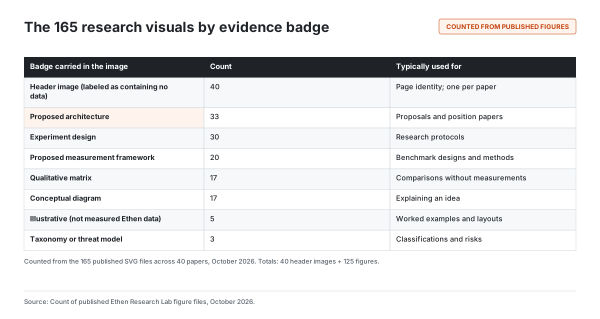
The distribution mirrors the archive itself. Proposals and position papers needed diagrams of how a proposed system would work, so "proposed architecture" is the most common badge. Research protocols needed diagrams of how an experiment would run: "experiment design". Benchmark designs and methods papers needed "proposed measurement framework". Comparisons without measurements became "qualitative matrix" tables, and explanations of ideas became "conceptual diagram". A handful of worked examples are marked "illustrative", with the explicit note that they are not measured Ethen data.
These are real counts from the published files. They are the only numbers in this article's figures, and they describe the figures, not the research.
Lesson 1: the form of a figure is a claim
The most important lesson came early. A reader who sees a bar chart assumes someone measured the bars. A line chart with an upward slope implies a trend in data. A scatter plot implies observations. Those assumptions are reasonable, because that is what those forms are for. Classic research on graphical perception, such as William Cleveland and Robert McGill's 1984 work on how accurately people read different chart types, takes for granted that charts encode quantities.
For a research program whose papers are mostly proposals and protocols, that creates a trap. It is easy to sketch "what we expect to see" as a chart — expected improvement, hypothetical cost curves, illustrative comparisons. Once that chart is shared on its own, nothing distinguishes it from a result.
So we adopted a strict rule: where there is no measurement, there is no axis, no bar, no scale and no number. Conceptual content uses conceptual forms — boxes and arrows, layered bands, flow diagrams, tables with qualitative cells. Figure 3 later in this article summarizes the distinction.
Lesson 2: put the evidence label inside the image
Captions are the traditional place to explain a figure, and good captions matter. But captions do not travel. A figure shared on social media, pasted into a slide or extracted by an AI system usually loses its caption.
So every one of the 125 figures carries a badge in the image itself: "Proposed architecture", "Experiment design", "Qualitative matrix" and so on. The header images carry a note that they contain no data. The badge is small and restrained, but it is part of the picture and cannot be cropped away without visibly cutting the image.
This was the single most useful decision in the visual system. It costs a few pixels and makes it much harder for a figure to be misrepresented.
Lesson 3: one message per figure
Weak figures usually try to say too much. A diagram that shows a system's architecture, its data flow, its failure modes and its evaluation plan at once becomes a maze that nobody reads.
The discipline we settled on was to write the figure's purpose in one sentence before drawing it. If the sentence needed "and", it became two figures. This is close to the first rules in a widely used guide, "Ten Simple Rules for Better Figures", which advises knowing your audience and identifying your message before anything else. Most papers ended up with three figures, each doing one job: one to explain the idea, one to show how it would be tested, and one to show what would count as success or failure.
Lesson 4: one visual system, deliberately plain
All 165 visuals share one visual system: a white background, charcoal text and lines, one accent color used sparingly for emphasis, a single typeface, no gradients, no shadows and no decorative imagery. Highlighting is reserved for one element per figure — the part the reader should look at first.
A restrained system has three benefits. Differences between figures reflect differences in content, not styling. Figures remain legible when reproduced small, printed or viewed in high-contrast modes. And a plain style signals that the figure is explanatory, not promotional. Research visuals that look like marketing invite the reader to discount them; we wanted the opposite.
Lesson 5: captions should say what the figure does not show
A good caption does two things: it states the figure's point in a sentence, and it rules out the most likely misreading. "A proposed pipeline; no component has been built or tested" does more work than "System architecture".
We found that the second half — what the figure does not show — was the part most often missing from first drafts and the part most valuable to readers. It forces the writer to think about how the figure could be misread, and it gives the reader the qualifier they need when they reuse it.
Lesson 6: alt text is content, not decoration
Every figure has alternative text, and we treated writing it as part of writing the paper. The W3C's guidance on complex images says that a text alternative for a chart or diagram should convey the essential information the image carries — the relationships, structure and values that are visually encoded — not just name the image.
In practice, that meant alt text that walks through the figure's structure: "Five stacked layers: identity, classification, relations, versions and presentation, with identity highlighted." It also meant mentioning the highlighted element, so a reader using a screen reader gets the same emphasis as a sighted reader. Writing alt text this way had a side effect we did not expect: it exposed unclear figures. If the alt text was hard to write, the figure was usually trying to say too much.
Lesson 7: decorative images need labels too
The 40 header images posed a different problem. They exist to give each paper a visual identity and are abstract by design. But abstract shapes can look like data visualizations — a cluster of points, a rising form, a network.
So each header image is labeled as containing no data, and its alt text says the same. That may seem excessive for a decorative image. It is the same principle as everywhere else: if a reader could reasonably mistake an image for evidence, the image must say it is not.
Lesson 8: automate the boring checks
At 165 visuals, problems that are obvious in one figure become invisible across many. Text that overflows a box by a few pixels, a badge that collides with a title, two figures in the wrong order, a caption that does not match its image, a missing alt text. We found and fixed all of these during production, and most of them were found by automated checks rather than by eye.
The checks that paid off were simple: every figure file referenced by a paper exists; every figure has alt text, a caption and a badge; figure numbering in the text matches the files; text stays within its containers; and no figure contains numbers unless it is explicitly sourced. Visual review still matters — automation cannot tell whether a figure is clear — but it should not be spent catching things a script can catch. We describe the broader editorial discipline in What We Learned Publishing 40 Research Papers at Once.
Five questions to ask before drawing a research figure
The lessons above condense into five questions, shown in Figure 2.
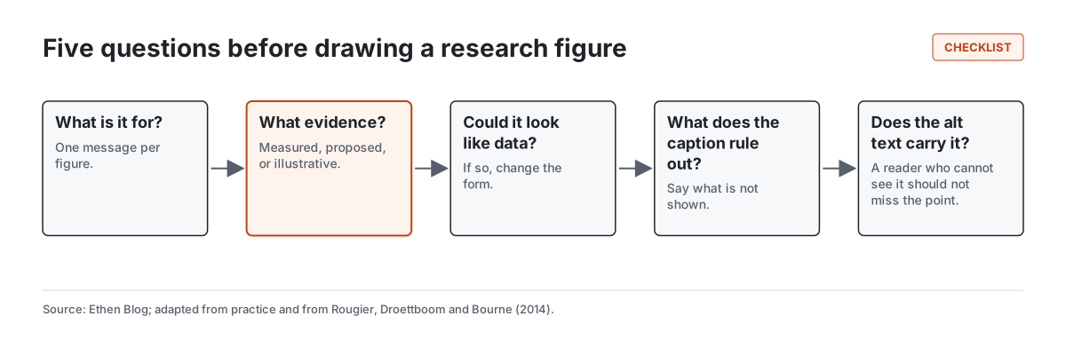
What is it for? One message per figure.
What evidence does it represent? Measured, proposed or illustrative. This decides the badge.
Could it be mistaken for data? If yes, change the form. This decides whether it can be a chart at all.
What does the caption rule out? Write the most likely misreading and exclude it.
Does the alt text carry the point? If someone who cannot see the figure would miss the message, rewrite it.
Conceptual figure or data chart?
Figure 3 summarizes the distinction that shaped every visual in the archive.
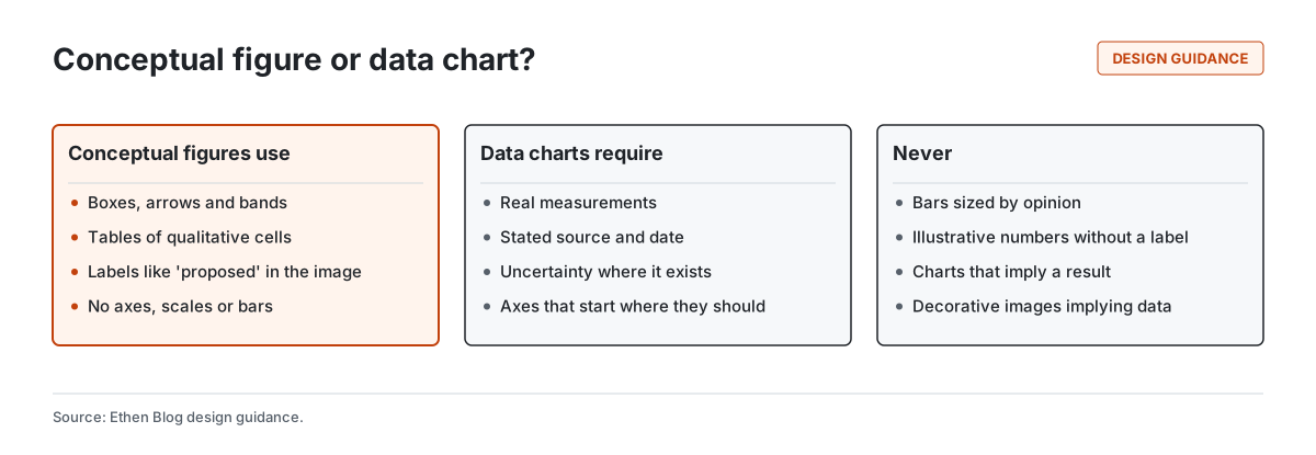
Conceptual figures use boxes, arrows, bands and qualitative tables, carry labels such as "proposed" in the image, and have no axes or scales. Data charts require real measurements with a stated source and date, show uncertainty where it exists, and use honest axes. And some things should never appear: bars sized by opinion, illustrative numbers without a label, charts that imply a result that does not exist, and decorative images that look like data.
When Ethen Research Lab publishes its first measured results, they will need data charts — and those charts will need to meet the second column's standard, including uncertainty and scope, as carefully as the system card does in text.
What we would do differently
Fewer architecture diagrams. "Proposed architecture" is the most common badge. Some of those figures could have been tables or short lists; boxes and arrows are not always the clearest way to explain an idea.
Earlier alt text. Writing alt text first, before drawing, would have caught unclear figures sooner.
Shared templates for families. Papers in the same family — a proposal, its protocol and its benchmark design — could share figure layouts, making the relationships between them visible at a glance.
Plan for results now. We should define the data-chart standard before the first results arrive, not after.
How this connects to the rest of Ethen
The same visual system now carries over to the Ethen Blog, so research and blog figures look consistent while their badges make the difference in evidence clear. The principle behind the badges — say what you know and what you do not — is the same principle we apply to product interfaces, as described in Why Ethen Shows What It Knows—and What It Doesn't. And the page design that frames these figures is described in Inside the Redesign of Ethen's Research Publications.
Tradeoffs and limitations
Plain can be dull. A restrained style is less eye-catching than illustrated or animated figures. We accept that for research, where trust matters more than attention.
Badges can be ignored. A label inside the image helps but does not guarantee careful reading.
Conceptual forms limit expression. Some ideas are easier to convey with a sketch of expected behavior. We chose to give that up rather than risk implying data.
Counts describe figures, not research. The numbers in Figure 1 count visuals by badge. They say nothing about the quality or importance of the research.
FAQ
How do you design good figures for research papers? Decide the single message, state what kind of evidence the figure represents, choose a form that cannot be mistaken for data if there is none, write a caption that rules out the likely misreading, and write alt text that carries the content.
How should conceptual diagrams be labeled? With a label inside the image, such as "Proposed architecture" or "Conceptual diagram", so the label survives when the figure is shared without its caption.
How do you write alt text for diagrams? Describe the structure and the key relationships, including what is emphasized, so someone who cannot see the figure gets the same message.
Should research figures ever show illustrative numbers? Only when clearly labeled as illustrative and not measured, both in the image and in the caption.
Do any Ethen research figures show measured results? No. As of October 2026, none of the 165 visuals plots a measurement.
Related reading
- What We Learned Publishing 40 Research Papers at Once
- Inside the Redesign of Ethen's Research Publications
- Building a Public Research Archive That Can Scale Past 100 Papers
- Why Ethen Shows What It Knows—and What It Doesn't
- Ethen Research Lab
References
- Rougier, N. P., Droettboom, M., & Bourne, P. E. (2014). Ten Simple Rules for Better Figures. PLOS Computational Biology, 10(9), e1003833. https://doi.org/10.1371/journal.pcbi.1003833
- Cleveland, W. S., & McGill, R. (1984). Graphical perception: Theory, experimentation, and application to the development of graphical methods. Journal of the American Statistical Association, 79(387), 531–554. https://doi.org/10.1080/01621459.1984.10478080
- W3C Web Accessibility Initiative. Complex Images (Images Tutorial). https://www.w3.org/WAI/tutorials/images/complex/
- Ethen Research Lab. Research Lab index. https://upcube.ai/resources/research