Inside the Redesign of Ethen’s Research Publications
The Ethen Research Lab redesign is built around one decision: every publication tells you what kind of evidence it contains before it asks you to believe anything. At the top of each page, before the title's argument or the abstract, readers see the publication type, an evidence status with a one-line explanation, the research program, the date and the institutional author. Figures carry their own evidence labels. References are numbered and point to persistent identifiers. The archive of 41 publications can be filtered by program, publication type, evidence status and topic, and its legend shows a zero beside "measured" because no publication yet reports new Ethen measurements. This article explains those design decisions, what they are meant to prevent, and what we are still working on.
The Ethen Research Lab redesign is built around one decision: every publication tells you what kind of evidence it contains before it asks you to believe anything. At the top of each page, before the title's argument or the abstract, readers see the publication type, an evidence status with a one-line explanation, the research program, the date and the institutional author. Figures carry their own evidence labels. References are numbered and point to persistent identifiers. The archive of 41 publications can be filtered by program, publication type, evidence status and topic, and its legend shows a zero beside "measured" because no publication yet reports new Ethen measurements. This article explains those design decisions, what they are meant to prevent, and what we are still working on.
Key takeaways
- Evidence status comes first. Type and evidence status sit above the argument on every page.
- Labels explain themselves. Each status carries a plain-language explanation, not just a badge.
- Figures are labeled too. Conceptual diagrams say they are conceptual; nothing invents data.
- Evidence status is a filter. Readers can find all protocols, or the single system card, in one step.
- Structured data never claims more than the page. Scholarly markup does not imply peer review.
Why redesign research pages at all?
Research pages carry a specific risk that marketing and blog pages do not: they lend authority. A claim on a page titled "Research" is read as more established than the same claim in a blog post. That is useful when the evidence supports it and harmful when it does not.
Ethen Research Lab publishes a mix of documents — position papers, research notes, proposals, protocols, benchmark designs, surveys and one system card. Most describe ideas, methods or plans rather than measured results. That is normal for a young research program, and we explain why we publish proposals before results in Why Ethen Research Lab Publishes Its Work in Public. But it means the pages have to work hard to prevent a reader — or a search engine, or an AI assistant summarizing the page — from mistaking a proposal for a finding.
The earlier presentation treated publications more like articles: a title, a date, a body. The redesign treats each one as a document whose kind matters as much as its content.
The anatomy of a publication page
Every publication page follows the same order, shown in Figure 1.
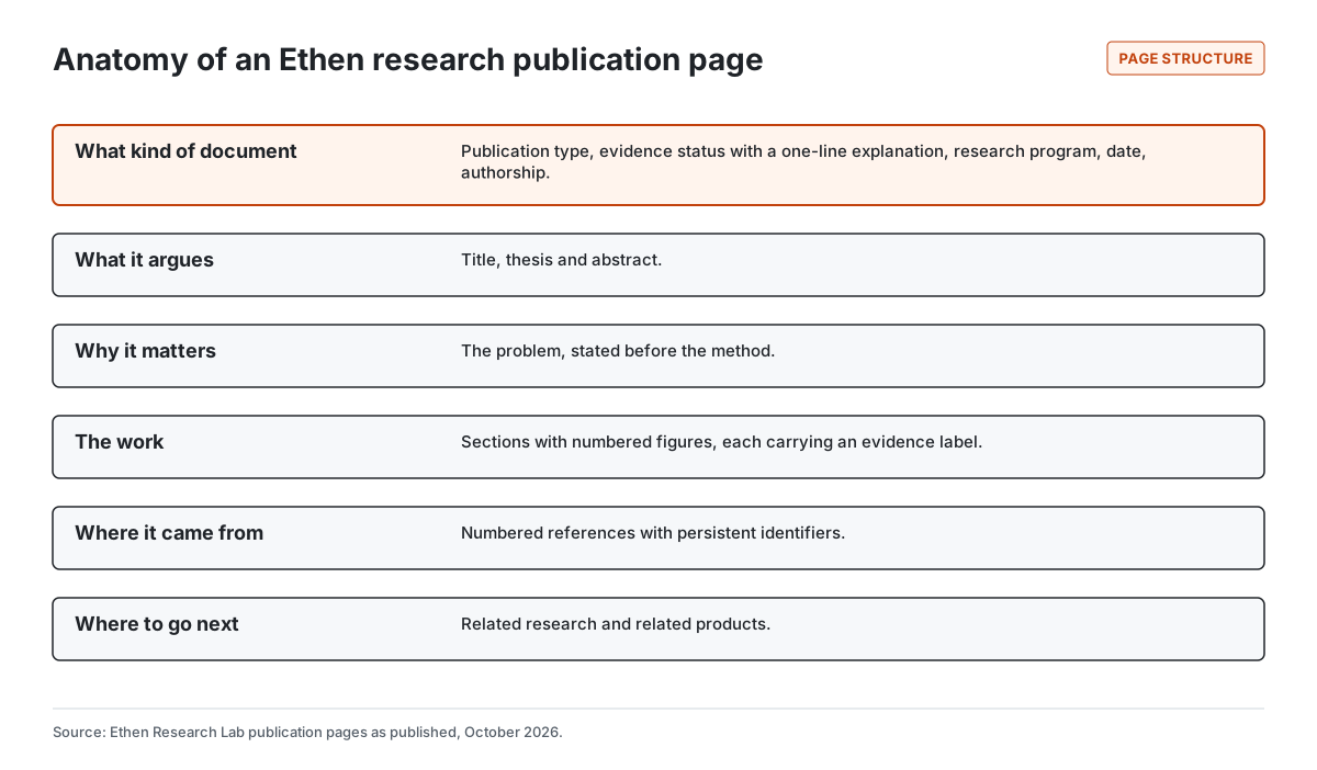
What kind of document. The page opens with metadata: the publication type (for example, Position Paper or Research Protocol), the evidence status with a one-line explanation, the research program, the publication date, the author — the institutional Ethen Research Lab — and an estimated reading time. A breadcrumb shows where the page sits in the archive.
What it argues. The title and a short thesis, then an abstract that states the position and its key definitions.
Why it matters. A short section on the problem, before any method. Readers who stop here should still leave with an accurate picture.
The work. The body, with numbered figures. Each figure has a caption and an evidence label, such as "Conceptual diagram", so a diagram that looks like a result cannot be mistaken for one.
Where it came from. Numbered references, with DOIs or arXiv identifiers preserved wherever they exist.
Where to go next. Related research from the Lab and, where relevant, related Ethen products.
The fixed order is the point. A reader who knows where to look can tell in a few seconds whether a page reports a measurement, proposes an experiment or argues a position.
Evidence status that explains itself
The most important element on the page is the evidence status, and the most important design choice about it was to make it explain itself. A badge reading "Protocol" means little to most readers. The redesigned pages pair each status with a sentence. A research synthesis is labeled as analysis of existing evidence and literature, with the note that no new Ethen measurements are implied. A protocol is labeled as a method that is defined but an experiment that has not been run.
The Research Lab landing page includes a legend with every status and how many publications carry it. Figure 2 reproduces those counts.
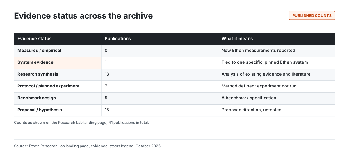
The zero beside "Measured / empirical" was a deliberate choice. It would have been easy to hide an empty category. Showing it tells readers exactly where the program stands: one system card reports results on one pinned build, thirteen publications synthesize existing work, and the rest are proposals, protocols and benchmark designs awaiting results. We discuss how the system card differs from the other publications in Why Ethen Uses System Cards and Research Notes Differently.
Figures that cannot pretend to be data
The 40 research papers carry 165 original figures between them. Almost all are conceptual: pipelines, matrices, lifecycles, decision trees. A conceptual diagram drawn in the style of a chart can look like a result, especially when shared out of context on social media or extracted by an AI system.
The redesign addresses this in three ways. Every figure carries an evidence label in the image itself, so the label travels with the picture. Captions say what the figure shows and what it does not. And there is no invented data: where no measurement exists, there is no axis, no bar and no number. We describe the lessons from producing those figures in What We Learned Publishing 165 Research Visuals.
Finding things in a growing archive
A research archive becomes hard to use quickly. Forty-one publications is already more than most readers will browse. The landing page is organized so readers can go from a question to the right document in a few steps, as Figure 3 shows.
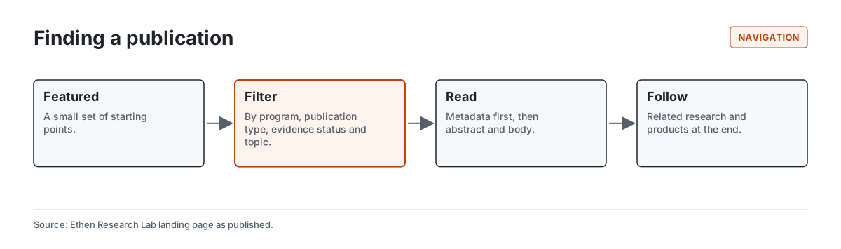
Featured publications offer a small set of starting points for new readers.
Filters let readers narrow the full archive by research program (such as Evaluation and Verification, or Trust and Accountable AI Work), by publication type, by evidence status and by topic, with sorting by date or featured status.
Making evidence status a filter rather than only a label was the most useful navigation decision. A reader who wants only documents with results can find the system card immediately. A reader who wants to see what experiments are planned can list every protocol. A reader evaluating Ethen's claims can see the whole distribution at once.
Each publication also links to related research at the end, so readers can follow a topic across a position paper, the protocol that would test it and the benchmark design that would measure it. We explain how the archive is designed to keep working past a hundred publications in Building a Public Research Archive That Can Scale Past 100 Papers, and how readers can use it in How to Explore Ethen Research Lab.
Metadata that does not overclaim
Research pages are read by machines as well as people. Search engines and AI assistants use structured data to understand what a page is. That creates a temptation to describe pages in the most authoritative terms available.
The redesign takes the opposite approach: structured data describes only what the page shows. Papers that are scholarly in form are marked as scholarly articles — a schema.org type that describes scholarly writing and does not assert peer review. Other publications, including the system card, are marked as technical articles. Authorship is the institutional Research Lab. No publication is marked as shipping a dataset, because none does. And evidence status, which has no faithful equivalent in the standard vocabulary, is shown on the page but not forced into a property that would misrepresent it.
This matters because summaries generated from structured data travel further than the page itself. An AI assistant that reads "scholarly article" and a reader who sees a peer-reviewed-looking layout could both infer more than is true. The safeguard is to say less in metadata and more on the page.
A system card is not a paper
The archive's one system card — which reports how one pinned Ethen build behaved across a set of enumerated conditions — has its own layout. It leads with what was run, on what build, with what method and what counts, and it states plainly what it is not: not a ranking, not a human-trust study, not a statement about other builds. Giving it a distinct page design, rather than dressing it as a paper, makes the difference between a measured result and an argument visible at a glance.
How different readers use the redesigned pages
The redesign was tested against the needs of four kinds of reader.
A researcher wants to know whether a publication contains anything new, and what kind. The type and evidence status answer that immediately. The numbered references with persistent identifiers make it quick to check the sources, and related research links show which protocol or benchmark design would test a position paper's claims.
A journalist or analyst wants to quote accurately. The one-line explanation beside each evidence status gives them the right qualifier to use — "a research proposal that has not been tested", not "Ethen research shows". The labels on figures mean that a diagram reproduced in an article carries its own warning.
A potential customer wants to know what Ethen has actually demonstrated. The evidence-status filter answers that directly, and the separate system-card layout shows exactly what was measured, on what, and with what limits. Product claims are not made on research pages; we explain why in Why Ethen Keeps Research Separate From Product Claims.
An AI assistant summarizing the page reads the same metadata and text. Placing the evidence status at the top, in plain words, makes it more likely that a generated summary carries the right qualifier, and keeping structured data modest avoids giving machines a stronger signal than the page itself.
Design principles behind the redesign
Several principles guided the work.
Honesty before persuasion. Every design choice was tested against one question: could this element make a reader believe something stronger than the evidence supports? If yes, it changed.
One visual system. All publications share the same typography, figure style and color accent, so differences between pages reflect differences in content, not presentation.
Readability for long documents. Research papers run to thousands of words. Comfortable line length, generous spacing around headings and figures, and clear hierarchy matter more on a research page than almost anywhere else. We continue to refine the reading layout as we learn from readers.
Accessible by default. Figures have descriptive alternative text, color is never the only carrier of meaning, and the structure works with assistive technology, following the Web Content Accessibility Guidelines as the baseline.
Explain the explanation. In a well-known essay, Chris Olah and Shan Carter described "research debt": the accumulated cost of research that is published but poorly explained. The redesign does not solve that, but its structure — thesis, abstract, why it matters, labeled figures — is meant to lower the cost of understanding each publication.
What we are still working on
The redesign is a starting point. Several things remain open.
Versioning. As protocols become experiments and proposals gain results, publications will change. We need clear version history so readers can see what changed and when, without old claims silently disappearing.
Citation support. Readers should be able to cite a specific version of a publication easily.
Results pages. When the first protocols produce results, those results need a presentation that is as clear about uncertainty and scope as the system card.
Reading layout. Long-form reading on wide and narrow screens continues to be refined.
We will note significant changes to the Research Lab in dated updates rather than silently rewriting this record.
Tradeoffs and limitations
Metadata first slows the start. Readers who want the argument must pass the labels. We think the few seconds are worth it.
Labels can be ignored. No design forces a reader to notice an evidence status. Repetition — on the page, in figures, in filters, in the legend — makes it harder to miss.
Categories simplify. Six evidence statuses cannot capture every nuance. Some publications mix synthesis and proposal; each carries its primary status, and the text explains the rest.
This is a dated record. The counts and structure described here reflect the Research Lab as published in October 2026.
FAQ
How is the Ethen Research Lab organized? Into research programs, publication types, evidence statuses and topics, all available as filters, with featured publications as starting points.
What does the evidence status on each page mean? It states what kind of evidence the publication contains — from measured results to untested proposals — with a one-line explanation.
Does Ethen Research Lab report measured results? As of October 2026, one system card reports results on one pinned build. No publication is labeled measured/empirical; most are syntheses, protocols, benchmark designs or proposals.
Are Ethen research papers peer reviewed? They are not presented as peer reviewed, and the page metadata does not claim peer review.
Why do figures carry labels? So a conceptual diagram cannot be mistaken for a data chart, even when shared on its own.
Related reading
- Why Ethen Research Lab Publishes Its Work in Public
- How to Explore Ethen Research Lab
- Why We Made Ethen Research Look More Like a Journal Than a Blog
- What We Learned Publishing 40 Research Papers at Once
- Ethen Research Lab
References
- Ethen Research Lab. Research Lab index (evidence-status legend and filters). https://upcube.ai/resources/research
- Ethen Research Lab (2026). AgentTrustBench system card: autonomy boundaries on one pinned build. System card. https://upcube.ai/resources/research/agent-trust-boundaries
- Olah, C., & Carter, S. (2017). Research Debt. Distill. https://doi.org/10.23915/distill.00005
- Schema.org. ScholarlyArticle. https://schema.org/ScholarlyArticle
- W3C. Web Content Accessibility Guidelines (WCAG) 2.2. https://www.w3.org/TR/WCAG22/