The Principles Behind Ethen’s Product Design
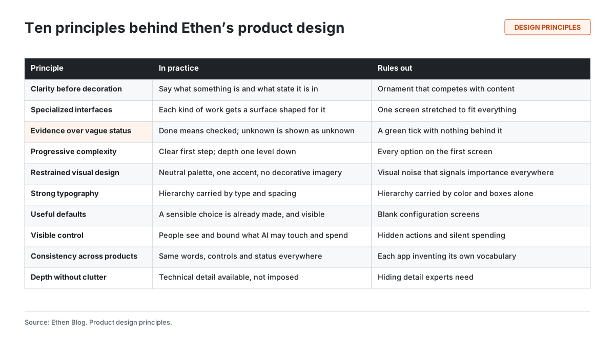
Ethen's product design follows ten principles. Clarity before decoration: say what something is and what state it is in before making it attractive. Specialized interfaces for specialized work: each kind of work gets a surface shaped for it. Evidence over vague status: "done" means checked, and unknown is shown as unknown. Progressive complexity: a clear first step, with depth one level down. Restrained visual design: a neutral palette and a single accent. Strong typography: hierarchy carried by type and spacing. Useful defaults: a sensible choice already made, and visible. Visible control: people can see and bound what AI may touch and spend. Consistency across products: the same words, controls and status everywhere. And technical depth without clutter: detail available, not imposed. Several of these AI product design principles are familiar from decades of interface research; what changes with AI is that the system's output can look finished when it is not, so honesty about status becomes a design problem rather than only an engineering one.
Ethen's product design follows ten principles. Clarity before decoration: say what something is and what state it is in before making it attractive. Specialized interfaces for specialized work: each kind of work gets a surface shaped for it. Evidence over vague status: "done" means checked, and unknown is shown as unknown. Progressive complexity: a clear first step, with depth one level down. Restrained visual design: a neutral palette and a single accent. Strong typography: hierarchy carried by type and spacing. Useful defaults: a sensible choice already made, and visible. Visible control: people can see and bound what AI may touch and spend. Consistency across products: the same words, controls and status everywhere. And technical depth without clutter: detail available, not imposed. Several of these AI product design principles are familiar from decades of interface research; what changes with AI is that the system's output can look finished when it is not, so honesty about status becomes a design problem rather than only an engineering one.
Key takeaways
- Ten principles, each defined by what it rules out. A principle that rules nothing out does not guide decisions.
- Evidence over vague status is the one most specific to AI. Fluent output makes unchecked work look done.
- Complexity should be progressive. Summary first, evidence one step away, the full record for those who need it.
- Control should be visible. People should see what the AI may touch and spend before it acts.
- Consistency is what makes specialized apps feel like one product.
- Restraint is a choice. Quiet visuals let status and content carry meaning.
Why AI products need explicit design principles
Most interface principles were developed for software that does exactly what it is told. A button saves the file; a menu opens the setting. AI systems differ in three ways that matter for design.
Output is uncertain. A generated answer, image or code change can be wrong in ways that are not visible on its surface. Design has to make uncertainty visible without making everything look uncertain.
Work can be long and delegated. An agent may work for an hour while the person does something else, then report back. Design has to communicate progress, decisions and outcomes for work the person did not watch.
Actions can have consequences. An AI system that can send, buy, change or delete needs controls people can see and understand before anything happens.
Human-AI interaction research has addressed these problems for years. Microsoft researchers' 2019 guidelines for human-AI interaction, validated with design practitioners against real AI products, recommend making clear what a system can do and how well, explaining why it did what it did, supporting efficient correction and dismissal, and timing interventions to the person's context (Amershi et al., 2019). Our principles build on that work and on long-standing usability heuristics (Nielsen, 1994). Figure 1 summarizes all ten.
1. Clarity before decoration
The principle: every element should first say what it is and what state it is in. Attractiveness comes second.
In practice, this means labels that name things plainly, status that is stated in words rather than implied by color alone, and layouts where the most important information is the most prominent. It applies to writing as much as to visuals: product text should say what happened, not how exciting it is.
It rules out ornament that competes with content: decorative illustrations behind data, animated flourishes on status changes, and marketing language inside the product.
2. Specialized interfaces for specialized work
The principle: different kinds of work get surfaces shaped for them. A conversation, a code review, a creative project and a long-running job need different things on screen.
Ethen's product family reflects this: Chat for conversation, Code for repositories, Studio for creative work, Research for investigations, Designer for design-to-build, Founder for delegated jobs. We explain the design reasoning in detail in Why Ethen Uses Specialized Interfaces Instead of One Universal UI, and the company reasoning in Why Ethen Is a Family of Specialized AI Apps, Not One App.
It rules out stretching one screen — usually a chat thread — to fit every kind of work.
3. Evidence over vague status
The principle: a status should tell the reader what was done, what was checked and what is not known. "Done" should mean checked.
This is the principle most specific to AI. A model's output is uniformly confident; a product that reports every result in the same assured tone gives people nothing to judge. Figure 2 shows the difference.
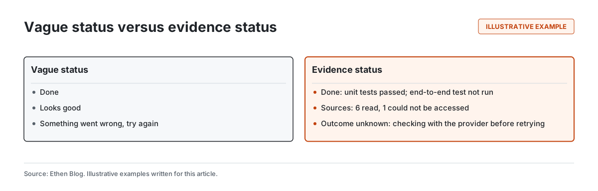
Ethen applies this in several published places. Ethen Model Intelligence displays "Unknown" when a benchmark value lacks a source, a date or a methodology, rather than filling the gap; see Showing Unknowns in Ethen Model Intelligence. Release certificates record which checks ran, against what, on what date and with what result. Ethen Research Lab labels every publication with its evidence status. We explain the broader principle in Why Ethen Shows What It Doesn't Know and the product mechanisms in What Ethen Is Doing to Make AI Outputs Easier to Verify.
It rules out a green tick with nothing behind it, "something went wrong, try again" when the outcome is actually unknown, and summaries that sound more certain than the work was.
4. Progressive complexity
The principle: show a clear first step and the most important information by default; put depth one level down, where anyone who needs it can reach it.
Jakob Nielsen described progressive disclosure in 2006 as deferring advanced or rarely used options to a secondary screen so that people can focus on the primary ones, and noted that designs with more than two levels of disclosure tend to have low usability. For AI work, we apply the idea to results as well as options. Figure 3 shows the three layers we aim for.
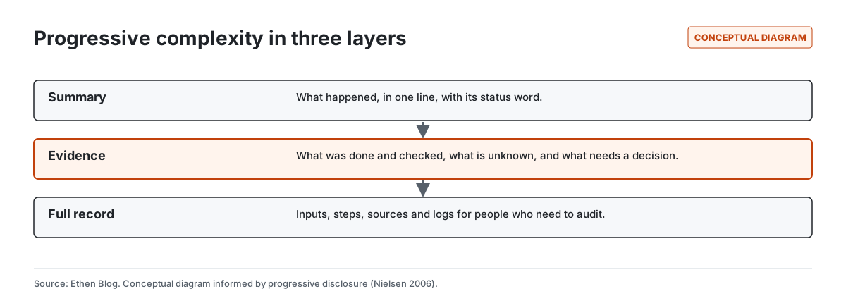
A summary says what happened, with a status word. One step down, the evidence says what was done and checked, what is unknown and what needs a decision. The full record — inputs, steps, sources and logs — is available to people who need to audit.
It rules out every option on the first screen, and also the opposite failure: hiding evidence so deep that nobody finds it.
5. Restrained visual design
The principle: use a neutral palette, a single accent color, and no decorative imagery in working surfaces. Let content and status carry the visual weight.
When everything is colorful, nothing stands out. A restrained palette means the accent can mean something: a decision waiting, a result that needs attention, the one row in a table that matters. The same restraint shapes Ethen's research figures, which use one visual system with a single accent and no decorative imagery; we describe what we learned designing them in What We Learned Publishing 165 Research Visuals.
It rules out gradients, decorative illustration and color used for mood rather than meaning in places where people are working.
6. Strong typography
The principle: carry hierarchy with type size, weight and spacing, so that structure survives without color and reads well at length.
AI products produce a lot of text — answers, reports, plans, evidence. Text that is well set is faster to scan and easier to trust. Ethen Research Lab's pages borrow conventions from journals for this reason: clear title and metadata blocks, numbered figures and references, and generous measure for long reading; see Why We Made Ethen Research Look More Like a Journal Than a Blog. Good typography is also an accessibility measure: sufficient contrast, scalable text and structure that assistive technology can read, as the W3C's Web Content Accessibility Guidelines describe.
It rules out hierarchy that depends only on color or boxes, and walls of undifferentiated text.
7. Useful defaults
The principle: a sensible choice should already be made, and the person should be able to see what it is and change it.
Defaults are where most people's experience is decided, because most people never change them. In Ethen Chat, for example, the model selector includes an automatic option that resolves to a default model, so a person can start without choosing among dozens of entries, while the choice remains visible and changeable. In Studio's published media pipeline, cost is quoted and budget reserved before a job runs, so the default is "you know the cost first."
It rules out blank configuration screens that make people decide everything up front, and hidden defaults that act without the person knowing what was chosen.
8. Visible control
The principle: people should be able to see, before it happens, what an AI system may touch, change and spend, and they should be able to stop or bound it.
Ben Shneiderman's 1983 description of direct manipulation emphasized visible objects and actions, and actions that are rapid, incremental and reversible. AI agents do not always allow reversibility — some actions cannot be undone — which makes visibility before action more important. Ethen binds computer-use approvals to one specific action in one run rather than to "keep going"; see Binding Computer-Use Approvals to Specific Actions. We describe how safety becomes part of the experience in Why Ethen Is Treating AI Safety as a Product Experience.
It rules out hidden actions, silent spending and approvals so broad they authorize things the person never saw.
9. Consistency across products
The principle: the same words, controls and status vocabulary everywhere in Ethen.
Specialized interfaces only work as a family if what people learn in one transfers to the others. An approval should look and behave the same in Code, Studio and Founder. "Unknown" should mean the same thing in a model table and in a job report. Memory and permission controls should live in the same place regardless of which app created the memory. Nielsen's heuristics have long listed consistency and standards among the basics of usability; in a family of apps, it is also what makes the family recognizable.
It rules out each app inventing its own vocabulary for the same idea.
10. Technical depth without clutter
The principle: detail experts need should be available, not imposed on everyone.
Ethen serves developers and operators who need logs, versions, model identifiers and exact costs, and people who need none of these. The answer is not to remove detail, which would fail experts, or show it all, which would bury everyone else. It is to put detail where experts expect to find it — one level down, in a consistent place — and keep the default view focused on the work. We explain the related argument about scope in Why We're Choosing Depth Over Feature Count.
It rules out hiding detail experts need, and also cockpit-style screens where every metric is always visible.
How the principles work together
The principles are not independent. Evidence status needs progressive complexity, or evidence overwhelms the summary. Visible control needs consistency, or people must relearn controls in each app. Restrained visuals need strong typography, or the hierarchy disappears. Specialized interfaces need consistency, or the family feels like unrelated tools.
When principles conflict, we generally favor the one that protects people from relying on something they should not: evidence over brevity, visible control over speed, clarity over decoration.
An example: one result, designed three ways
The following example is illustrative.
An agent has finished updating a set of documents. A decorative design shows a celebratory animation and "All done!" A minimal design shows a tick. Neither tells the reader what to check.
A design following these principles shows one line: "Updated 11 of 12 documents; 1 needs your decision." One step down: which documents changed, what was checked, and the one document where the agent found conflicting instructions and stopped. Further down: the full record of edits and sources. The accent color appears once, on the decision. The person knows in two seconds whether they need to act, and in thirty seconds what to check.
Tradeoffs and limitations
Restraint can look plain. Some people prefer expressive interfaces. We accept looking plain in exchange for status that stands out when it matters.
Evidence takes space and words. Status with evidence is longer than a tick. Progressive complexity mitigates this but does not eliminate it.
Consistency slows local improvements. A better pattern in one app should change everywhere, which takes longer than changing one app.
Principles are applied unevenly. These describe what we aim for. Not every current surface meets every principle, and we would rather say so than imply otherwise.
FAQ
What are good design principles for AI products? Make status honest and evidence-based, keep complexity progressive, make control visible before action, keep vocabulary consistent, use specialized interfaces for different kinds of work, and let content rather than decoration carry the design.
How should an AI app show what it did? With a short summary and a status word, evidence one step away — what was done, checked and unknown — and the full record available for audit.
Why does Ethen use restrained visual design? So color and emphasis can carry meaning. When the accent appears, it should mean a decision or a problem needs attention.
How does Ethen keep many apps consistent? By sharing vocabulary, controls and status words across apps, so what people learn in one transfers to the others.
Does every Ethen surface already follow these principles? No. They describe what we design toward; some surfaces meet them more fully than others.
Related reading
- Why Ethen Uses Specialized Interfaces Instead of One Universal UI
- Why We're Choosing Depth Over Feature Count
- What We Want Ethen to Feel Like in 2027
- What a Release Certificate Actually Proves at Ethen
References
- Amershi, S., et al. (2019). Guidelines for Human-AI Interaction. Proceedings of CHI 2019. https://doi.org/10.1145/3290605.3300233
- Nielsen, J. (1994, updated 2024). 10 Usability Heuristics for User Interface Design. Nielsen Norman Group. https://www.nngroup.com/articles/ten-usability-heuristics/
- Nielsen, J. (2006). Progressive Disclosure. Nielsen Norman Group. https://www.nngroup.com/articles/progressive-disclosure/
- Shneiderman, B. (1983). Direct Manipulation: A Step Beyond Programming Languages. Computer, 16(8), 57–69. https://doi.org/10.1109/MC.1983.1654471
- W3C. (2023). Web Content Accessibility Guidelines (WCAG) 2.2. https://www.w3.org/TR/WCAG22/